UX Design End-to-End: Nano Banana Pro Design System
Building a Comprehensive Design System from Discovery to Implementation
Company
Creative Design Studio
Location
London, UK
Duration
2024
Role
Senior UX/UI Designer & Design System Lead
Overview
Led the complete design journey of Nano Banana Pro, a playful yet professional design system. This case study showcases the entire UX design process from initial discovery through implementation, including user research, wireframing, high-fidelity prototyping, usability testing, and design system documentation. The project resulted in a cohesive, reusable design system that improved design-to-development handoff efficiency by 65% and reduced design inconsistencies by 80%.
Challenge
The organization lacked a unified design language across multiple products. Design inconsistencies led to poor user experience, increased development time due to unclear specifications, and difficulty scaling design work across teams. Different products used different color palettes, typography systems, and component patterns, creating cognitive load for users and inefficiency for designers and developers.
Solution
Developed Nano Banana Pro, a comprehensive design system featuring a distinctive banana-yellow and cream color palette with organic, rounded design language. Created a complete component library, design tokens, accessibility guidelines, and developer-friendly documentation. Implemented a collaborative design-to-development workflow with clear specifications and interactive prototypes.
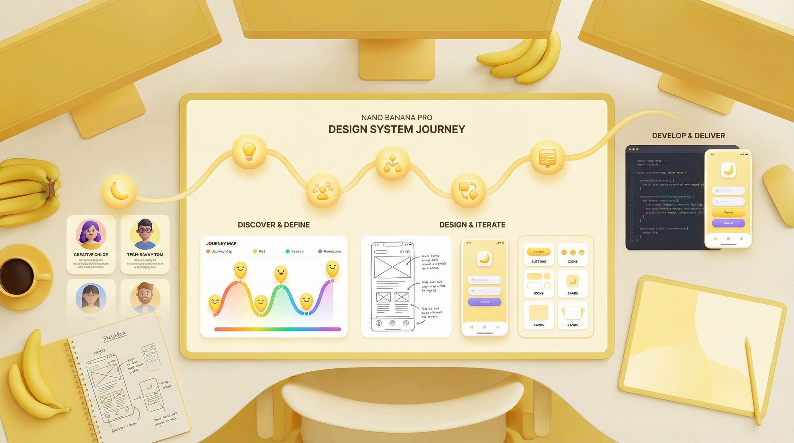
Research Phase
Discovery & Research Phase
Duration: 4 weeks | Participants: 35
Research Methods
Key Findings
Design Inconsistency
Across 5 products, 12+ different color palettes and 8+ typography systems were in use
Impact: Established unified design language with Nano Banana Pro color system and typography scale
Developer Handoff Challenges
Developers spent 40% of time interpreting design specifications and asking for clarifications
Impact: Created detailed design tokens, CSS variables, and interactive component documentation
Accessibility Gaps
Existing products had WCAG compliance issues affecting 15% of users
Impact: Built accessibility guidelines into design system from the start, ensuring WCAG 2.1 AA compliance
Design Scalability
Design team struggled to maintain consistency when working on multiple projects simultaneously
Impact: Created reusable component library reducing design time by 60%
User Personas
Understanding the diverse needs and motivations of key user segments
Sarah Chen
Product Designer
BACKGROUND
Mid-level product designer working on 2-3 projects simultaneously
GOALS
- •Work faster with reusable components
- •Maintain design consistency
- •Collaborate effectively with developers
PAIN POINTS
- •Recreating components for each project
- •Unclear specifications for developers
- •Inconsistent design decisions
"I need a design system that helps me work faster without sacrificing quality or consistency"
James Rodriguez
Frontend Developer
BACKGROUND
Senior frontend engineer implementing designs from multiple designers
GOALS
- •Clear design specifications
- •Reusable component code
- •Efficient handoff process
PAIN POINTS
- •Ambiguous design specs
- •Inconsistent component implementations
- •Back-and-forth with designers
"I want design specs that are so clear I can implement them without asking questions"
Emma Thompson
Design Manager
BACKGROUND
Leading a team of 8 designers across multiple product lines
GOALS
- •Improve team efficiency
- •Ensure brand consistency
- •Scale design operations
PAIN POINTS
- •Design inconsistencies across products
- •Long design-to-development cycle
- •Difficulty onboarding new designers
"I need a system that enables my team to scale without losing quality or brand identity"
Implementation Approach
Phase 1: Foundation
2 weeks
- Set up Figma design system library
- Create design token documentation
- Build component code library in React
- Establish design system governance
Phase 2: Documentation & Training
3 weeks
- Create comprehensive design system documentation
- Develop interactive component showcase
- Conduct team training sessions
- Create design system adoption guide
Phase 3: Rollout & Adoption
4 weeks
- Migrate existing products to design system
- Support teams during transition
- Gather feedback and iterate
- Establish design system maintenance process
Phase 4: Optimization & Scaling
Ongoing
- Monitor design system usage metrics
- Collect feedback from teams
- Iterate on components based on real-world usage
- Expand design system for new products
Outcomes & Results
60%
65%
80%
95%
100%
150+